Last month I was in Chicago for work and I was very inspired by the Chicago Union Station. What a fine building the Chicago Union station is, with its elegant limestone exterior and that romantic passenger hall. I thought it's one of Chicago’s most iconic structures, reflecting the city’s strong architectural heritage. Its combination of Bedford limestone Beaux-Arts facades, massive Corinthian columns, sparkling marble floors, and magnificent Great Hall, all highlighted by brass lamps, creates an environment that captures the allure and imagination of anyone on its premises. As I walked throughout the exterior hall I couldn't stop looking up, and wondering why I couldn't stop. It probably had something to do with the beautiful coffered ceiling that is perfectly symmetrical.
Maybe this is the reason I like spaces to feel balanced. Symmetry can balance an area of your home, it can draw the eye and is said to create a feeling of safety, comfort and familiarity. Symmetry should not be over done, you don't want it to become monotonous, so don't forget to include a few surprises like a sculpture of a hand or feet! More popular in traditional interiors, however used correctly it can work magic in a contemporary living space. Often I buy pieces for my projects in two's, a matching pair of consoles, candelabras, side tables, vases, mirrors or a pair of chairs, all can look fabulous when placed symmetrically. Do you love symmetry or do you prefer asymmetrical styling in your home? I often get off on tangents it's because I get so excited when talking about design that all these ideas and concepts suddenly begin to pop up in my head. I have so much to tell you. :)
Now lets get to the fun stuff my inspirations. My inspiration comes from everywhere. Like everyone else I get a lot of inspiration from design magazines, books, and museums but I truly get the most inspiration when I travel. I love staying in small boutique hotels and bed 'n' breakfasts that have unique designs that spark my creativity. I tend to rise early for early morning walks to explore local flee markets before the crowds take them over. I also draw a lot of my inspirations from natures colors and natural designs. They are true works of art that I highly appreciate and incorporate into my works. I am inspired by great art and architecture, particularly styles native to L.A as reflected in such deco icons as the Union Station. I love the diversity of Southern California, from the Watts Tower which is a world renowned icon of found objects worked into monumental heights to the dominance of the Griffith Park Observatory as an Art Deco masterpiece of great design and deliberation. I see the city as a huge canvas from which I pick and choose from. I use all my inspirations in my projects although working on commercial projects is a completely different animal than residential.
I'm also mad about Googie architecture. That was bold, groundbreaking design, with form following functions, eye catching designs to get the attention of people in cars to stop at an restaurant a motel or a gas station. We always have something to learn from the past and you never stop learning, because every time you look you discover something new you've never seen before. Keep your eyes peeled and never stop learning. -M
Ceilings. Design is about all those small little details you may not even notice initially
Look up!
Mix of traditional and modern.
I sell a similar side branch side table in my shop. Get it here: http://melodyinteriordesign.com/shop/product/forest-park-table-3/
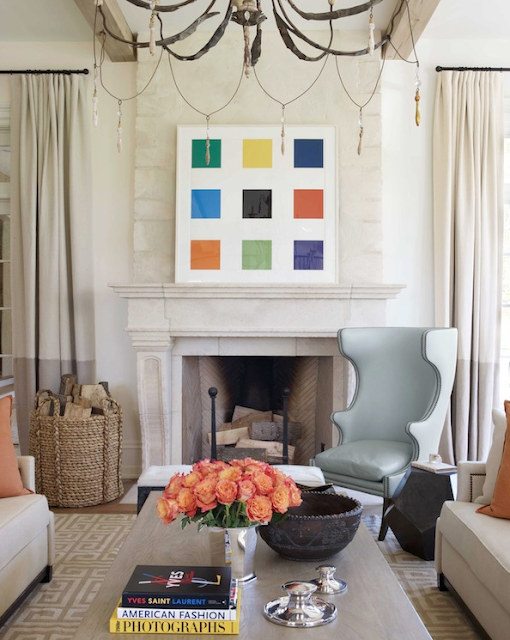
Split colored drapes can be used to ground a room or create a visual chair rail.
Get this lamp from my shop at: http://melodyinteriordesign.com/shop/product/lawton-lamp/
Another fabulous lamp that has more visual weight from my shop: http://melodyinteriordesign.com/shop/product/cordaje-lamp/
That ceiling, those velvet chairs, and classic chandelier.
Amazing Italian chandelier from my shop. Get it here:
http://melodyinteriordesign.com/shop/
Add visual interest to a space through dramatic lighting and art that may not exactly fit in, but works somehow. In this instance they used a very modern piece of art in a traditional room.
Monochromatic, works all the time. In these spaces it's especially important to pay attention to what type of textures you're using in the room, since everything is a similar color.


0 comments:
Post a Comment